The storyline is loosley based around this boy and girl. At the beginning James looks at the video on the wall, then it goes into the music video. And the end it is sarah looking at the film finally walking of together. We was originally going to have it projected onto the t-shirt however we somehow got led to do it this way. Which works aswell. We tried on a white background and on black. The white area didnt turn out the best for what we wanted it for. As they walk of to the left and where we were there wasnt enough white wall to cover the whole section , so basically we are sticking with black. The beginning and end will be the last thing to do as we need to put it on final cut to be able to the the split screen. It should be simple though as it is only a picture being transfered onto the wall.Fingers cross!
Monday, 8 February 2010
Beginning and the end.
The storyline is loosley based around this boy and girl. At the beginning James looks at the video on the wall, then it goes into the music video. And the end it is sarah looking at the film finally walking of together. We was originally going to have it projected onto the t-shirt however we somehow got led to do it this way. Which works aswell. We tried on a white background and on black. The white area didnt turn out the best for what we wanted it for. As they walk of to the left and where we were there wasnt enough white wall to cover the whole section , so basically we are sticking with black. The beginning and end will be the last thing to do as we need to put it on final cut to be able to the the split screen. It should be simple though as it is only a picture being transfered onto the wall.Fingers cross!
re-re-shoot
Okay we have decided last minute to reshot our band sequence. Just have something simple without an effect with close ups on the band. The day we decided to do it was actually a really nice day. It was sunny with a little layer of snow which gave a bright reflection. As it has been a while since we done the first go they knew the song much better, which is what we needed as we was not adding an effect so they synch had to be perfect.

This was the look of it - but once again when putting it into the music video it really didnt go. So once again we went back to the orginal footage. We spent a little time on editing and trying out different effect, but still keeping the edge look. We turned the brightness up high so it is mostly white now. It looks like this..

I like it mainly for the performance and also it is the closest we have got to our original idea. To date we are sticking with this as it fit almost perfect, theres one scene where we had to add some stills, overall it goes with the music.
Sooo hopefully this means the band section is complete!
The band.
A few post back showed/and talked about the band sequence. Eventhough it is only a small bit of the music video it is important as it breaks all the photographs up. We were told and thought it was to create a silhotte in finale cut by having them in front of a white background. However i didnt work out, one reason was we stupidly put the camera on the side not thinking that it would be turned up on the screen. So most of Ross's shots looked like this.

It was/is extremly fustrating. But even more annoying the the silhotte didnt work. We tried uping the contrast but it just isnt what we had in mind. Ideally we need a massive thing sheet ( that is pinned up) with a huuggee light behind the person. But i think we are running out of time and its just not working. We thought of different ways to present the band. We have got some photos of the band to carry through the transiton if each section but like i said i think we need real footage. We also tried a photomontage, inspired by the The Reeling, Passion Pit song, and also Kings of Leon CD cover where sections of a face builds up one.

But i think it dosent fit in the video so we cut it out. Still trying to find something to fit in and runnig out of time! As we need to know where everything is going, we decided to return back to what we done. We used an effect called Edge which basically just shows the edge. It is the closest we could get to a sillhote without having one. However it is very dark. And is a big contrast as most of the video is still light. Argh have to think of new ideas !
update.

Since we filmed we have put all the footage into sections, this is so it is easier to sort them out. Also some of the scenes were are going to edit using photoshop. It is a long process however it is much more easier doing it with photographs compared to last year when it was starting from scratch. In the beginning shot we have James walking across the right of the screen. The colour creeps up eventually making the whole screen colour to set up the rest of the video. How i did this was to marquee the background and bit by bit bring more colour into the shot.

At the same time rebecca took the moths section in the instrumental part. Our first ideas was to have the moths throughout the music video however having over 250 photographs i think we was being to ambitious. So we choose the instrumental as it is a slow bit in the song where the song or music dosent really change. We used a filter called "cut out" on the instrumental part ( also the stills of the band) because when we watch passion pit first release, the real band, they had an effect of magazine ripped so we wanted it to be contious and having it a bit different. The same as the walkin across, the moths move by section by section moved. We also have been doing a cut out city. This was our first idea for our music video we saw an advert and like the storybook pop up look. However we did a tester ( admittly with cardboard) and it just didnt look write. So we decided to have each photograph appear to make up a picture. At the moment we are having trouble with getting them to appear on the beat of the music. I think that it wont never be perfect, but i really want it too so just going to have to try new things.


Target Audience.
We have decided that our target audience would be anyone between the age of 16-30. It is a broad age range as music interest is subjected, however our style of the video would be more for the younger/middle age. This is because i think animation and cartoons are more of a younger thing.
However it would be liked by older people but maybe just for first look, i think 16-30 would reutun to watch it again.
However it would be liked by older people but maybe just for first look, i think 16-30 would reutun to watch it again.
Friday, 8 January 2010
Bands/Artist promotion. Analysis of CD covers
This is Passtion Pits album cover, the band who sing moths wings. I like this cover as it is simple. But also the marks on it, it sound silly but when look at the colour you keep looking at the minor detail. Also it is dark and dosent reveal much. So is interesting if you are a fan, as you know then name and artist and if your not a fan it look myseterious. 
Madonna celebration is based on Andy Warhol pop art work, which i like. It fits with her being in that pop culture and sums up the changing faces on madonna. This one she is immating Marylin Monroe. I also like the newspaper magazine look.
 Ive always loved this album cover, the inside bit aswell, as it just so interesting to look at. He is everyone down to the smallest person on the right. Also he has a running theme of having his name down the side which i like, it is like he has branded it. Also i think it is perfect which is why i like it. It isnt just a profile picture of the artist, it has fun and somethig to look at. The cd cover is matching the cd.
 This is an example of the profile pictures i said previously. They do work though, the simple and black and white works well for this album. Also being the greatest hits you can not apply it to one album so for a stretch of time it works.

Madonna celebration is based on Andy Warhol pop art work, which i like. It fits with her being in that pop culture and sums up the changing faces on madonna. This one she is immating Marylin Monroe. I also like the newspaper magazine look.
 Ive always loved this album cover, the inside bit aswell, as it just so interesting to look at. He is everyone down to the smallest person on the right. Also he has a running theme of having his name down the side which i like, it is like he has branded it. Also i think it is perfect which is why i like it. It isnt just a profile picture of the artist, it has fun and somethig to look at. The cd cover is matching the cd.
 This is an example of the profile pictures i said previously. They do work though, the simple and black and white works well for this album. Also being the greatest hits you can not apply it to one album so for a stretch of time it works.
Wednesday, 9 December 2009
Media - Music video shoot / 2
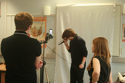
Yesterday we shoot the band sequence, we are still going with the sillhote style. To do this tho we places our three band members, george, kirsty and ross, against a white background. As none of them was wearing white we can select the colour and wipe it out in final cut pro. We had a little problem that they didnt really know the song, we did play it to the before we shoot but the song has an awarked beat. But we did say as long as you just move with the music then it dosent really matter what you sing as it will be sillhoted.


Subscribe to:
Posts (Atom)